Changing wall color remains one of the quickest ways to transform an apartment without major work. But you need to make the right choices: a shade that looks perfect on a color swatch can disappoint once applied to a 3.5-meter wall with poor exposure. Here's how to think room by room, considering both color and finish.
Color trends to know before choosing
The return of natural tones
After years of pure whites and cool grays, current palettes are moving toward warmer and more mineral colors. In 2026, Parisian interiors are turning toward soothing and natural tones, breaking away from the long period of pristine white.1 Sage greens, terracottas and warm beiges are making a strong comeback in living rooms and bedrooms alike.
Among the tones most frequently seen in recent projects:
- Sage, eucalyptus or olive green, for a soothing atmosphere
- Ochres, terracotta and dusty pinks, to warm up a living area or open kitchen
- Petrol or navy blue, as an accent on a single wall or throughout an entire bedroom
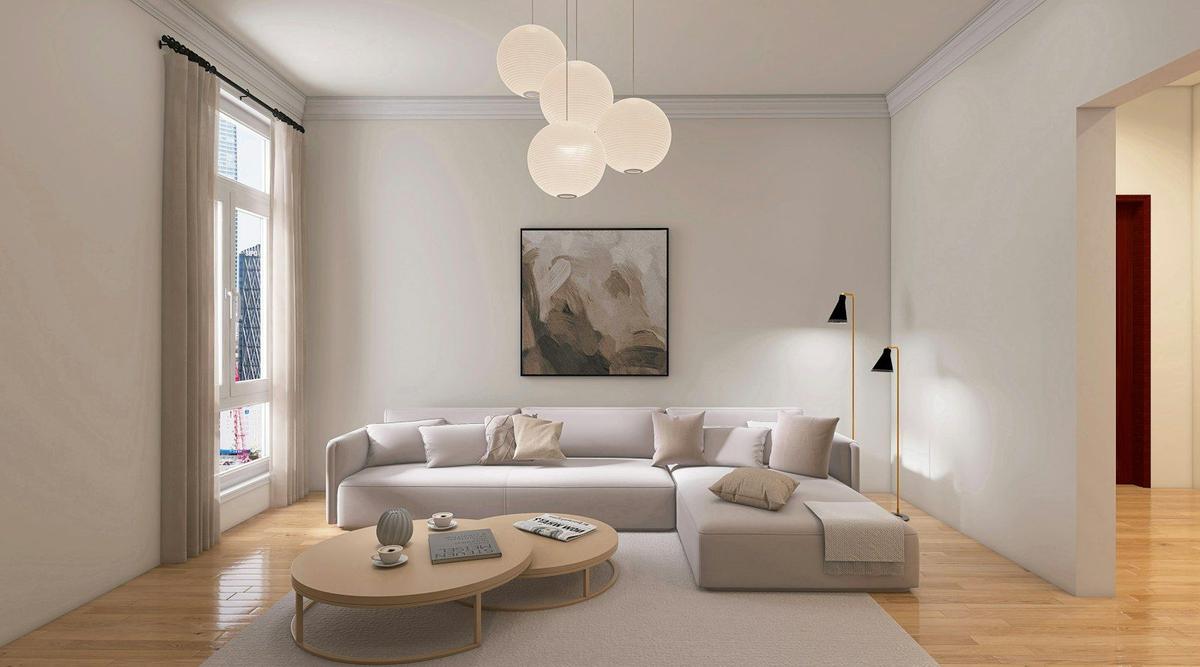
- Off-white and linen beige, always reliable for visually enlarging a space
Mineral pigments are making a major comeback: yellow ochres, terracottas and dusty pinks dress walls with warmth and fit particularly well in living spaces and open kitchens.
One color per room, not one color throughout
There's no need to paint the entire apartment in the same shade. Many recent renovations instead opt for a dominant color in living areas, a softer tone in bedrooms, and an accent color reserved for a single wall to avoid darkening the overall space. These tones are often applied to a single wall to create a decorative effect without darkening the entire room.2 For apartments with moldings and cornices, the choice of color and its contrast with the relief details deserves special attention, a topic already covered in our article on painting and moldings3.
Choosing the right finish based on room use
Matte, velvet or satin: the differences that matter
Finish changes the final look as much as color itself. Matte absorbs light and better hides small irregularities on older walls, but it marks more easily on contact. Satin reflects more light and cleans easily, making it practical in damp or high-traffic rooms, but it also reveals surface defects. Velvet sits between the two: a good compromise for most living spaces.
| Finish | Visual result | Maintenance | Recommended rooms |
|---|---|---|---|
| Matte | Absorbs light, hides defects | Delicate, sensitive to marks | Bedrooms, ceilings, low-traffic living rooms |
| Velvet | Soft, slight sheen | Easy | Living room, family room, child's bedroom |
| Satin | Luminous, reflects light | Very easy, washable | Kitchen, bathroom, entryway, hallway |
Adapt finish to the room's light
A room's orientation influences the choice of finish as much as color. In a very bright south-facing living room, a satin finish can create annoying reflections in the evening, while a velvet or matte finish softens this effect. Conversely, in a dark room facing the courtyard, a satin finish in a light shade helps bounce more light back. This is also a point we cover in our article on choosing colors and finishes for an apartment4.
Special case of older buildings and Haussmann-style apartments
Uneven walls, high ceilings
In older buildings, walls often have several layers of paint and present small irregularities invisible to the naked eye before application. A matte or velvet finish is generally more forgiving than satin, which would tend to emphasize every flaw under light. High ceilings, typical of Haussmann apartments, can support deeper tones without overwhelming the room.
Consider coherence with woodwork and frames
In these apartments, baseboards, trim and window frames are often painted in a different tone from the walls, usually in satin to resist daily contact. This coherence between wall, ceiling and woodwork often makes the difference between an amateur result and one that stands the test of time.
From color choice to quote: what to check before starting work
Once the palette is decided, the question of budget and execution quickly arises. A few practical points to keep in mind:
- A quote calculated per m² remains always indicative at this stage: two rooms of the same size can require very different preparation depending on the actual condition of the walls (cracks, fragile plaster, old paint layers). The final price can only be confirmed after assessing the actual condition of surfaces, whether through photos and videos or during a site visit - both work the same way. On our platform, we systematically request photos and videos of surfaces before finalizing a quote to avoid surprises during the project.
- A serious quote must always come from a professional who has seen the space, either remotely via photos and videos or during a visit: both options are valid.
- Once the project scope is set (colors, finishes, rooms involved), it's useful to keep this information accessible in writing. On our platform, all project details remain online: the client, the professional and the platform can consult the agreed scope at any time.
- Verifying that the professional contacted is properly registered with a valid SIRET number remains a basic precaution. Our platform validates that all painters are properly registered with a SIRET before offering them as an option.
For more on the factors that affect painting quote costs, our article on painting budget5 covers these elements in more depth.
Frequently Asked Questions
No, it's common to mix finishes in the same room. An accent wall can be in velvet or matte to create depth, while baseboards or trim remain satin to resist daily wear.
Light and warm tones like off-white or linen beige help visually enlarge the space and compensate for lack of natural light. A satin finish on walls can also bounce more light around the room.
Yes, a matte finish marks more easily on contact and doesn't withstand repeated cleaning as well as satin. That's why it's better reserved for bedrooms, ceilings and low-traffic rooms.
It's recommended to test the shade on a sample at least 50 cm wide directly on the wall in question, then observe it at different times of day. Natural and artificial light significantly alter how a color looks depending on room orientation.
It depends on the condition of the wall and the finish chosen. A matte finish tolerates an imperfect surface better, while a satin finish requires more careful preparation because it reveals more irregularities.

Ready to paint?
Get free quotes from verified local painters in minutes. No commitment.
Sources
External sources open in a new tab.
- Couleurs peinture intérieure tendance 2026 — Decorev75 Parisdecorev75.fr
- Tendances couleurs peinture intérieure 2026renozen.fr
- Peinture et moulures : sublimer l'architecture de votre appartementmyfixio.fr
- Comment choisir couleurs et finitions pour votre appartementmyfixio.fr
- Budget peinture : comprendre ce qui fait vraiment varier le devismyfixio.fr