Choosing the right colors for a Haussmann apartment
Haussmann apartments have strong architectural features: moldings, original parquet floors, fireplaces, and generous ceiling heights. These elements directly influence your choice of colors and finishes.
Trending tones
Mineral tones such as ochres, terracottas, and deep blues are gaining ground, whether used as an accent color on a single wall or as a complete room finish. Intense, deep blues (petrol, midnight, slate) continue to appeal, applied as accent colors or for entire rooms, bringing remarkable depth.
When to choose restraint
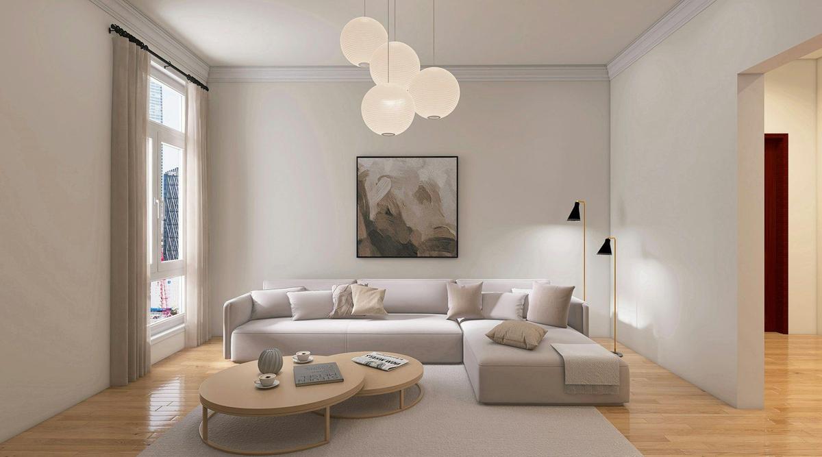
Not all Haussmann apartments suit bold tones. If the apartment retains fine moldings, herringbone parquet, or a marble fireplace, a more restrained palette highlights these details without competing with them. Warm whites (cream, linen, ivory) remain a safe choice in such cases: while pure white is declining, warm whites (cream, linen, ivory) remain essential, opening up spaces while adding warmth, unlike cold white which can feel clinical in Parisian apartments that often receive less light than expected.
Room-by-room comparison table
| Room | Recommended tone | Recommended finish | Key consideration |
|---|---|---|---|
| Living room with moldings | Sage green or off-white | Matte on ceiling, velvet on walls | Preserve molding relief |
| Bedroom | Navy blue or soft terracotta | Matte or velvet | Test tone according to exposure |
| Kitchen | Off-white or aqua | Satin washable | Splash resistance |
| Bathroom | Blue-grey or off-white | Satin suited to humidity | Ventilation and condensation |
| Hallway, entrance | Soft ochre or warm grey | Satin | High-traffic area |
Choosing the right finish for room use
Matte, velvet, or satin: what's the difference
Finish changes how you perceive a color as much as the tone itself. A matte finish absorbs light and better conceals minor imperfections in old plaster, making it a frequent choice for ceilings. A satin finish reflects more light and suits high-traffic or damp rooms, while a velvet finish (or matte satin) offers a soft compromise for living spaces.
A few practical guidelines:
- Matte: ceilings, moldings, bedrooms with low wear
- Velvet: living room, bedroom, and hallway walls
- Satin: kitchen, bathroom, high-traffic rooms
- Glossy or lacquered finish: woodwork, doors, accent elements
Adapting finish to the actual wall condition
Old cracked plaster, irregular render, or visible seams often point toward a matte finish, which is more forgiving. On a recently repaired or well-prepared wall, a velvet or satin finish can instead enhance the color without emphasizing flaws. Before confirming a finish, it helps to assess the real condition of the surface, a topic we cover in our article on hidden surface defects.
From color choice to project execution
Once your palette is set, the next step is turning these choices into a concrete quote. Many paint quotes are calculated per m², but this type of estimate always remains indicative: two rooms of the same size can have very different conditions (cracks, degraded render, water stains), which directly affects preparation time and thus the final price. The definitive price can only be confirmed after the professional has assessed the actual wall condition, whether via photos and videos or an on-site visit, both working the same way. On our platform, we systematically request photos and videos of surfaces before finalizing a quote, to avoid surprises during the project.
Once you've discussed colors and finishes with the painter, it's useful to document this scope clearly. On our platform, all project details (colors, finishes, surfaces involved) remain visible online for the client, the professional, and the platform alike, preventing misunderstandings about what was agreed. For checks to make before signing with a painter, our article on verifications before signing covers the essential points.
Frequently Asked Questions
No, it is not required. Many owners choose a slightly different tone, often lighter or matte, so that light reveals the molding relief without blending it with the wall.
Not necessarily. Used as a solid color on a single wall or as a dado rail, a dark tone can actually structure the space and give it character, especially in rooms with the generous ceiling heights typical of Haussmann apartments.
The most reliable way is to test a sample directly on the wall in question and observe it at different times of day. A north-facing room tends to cool tones, while south or west exposure warms them.
A satin finish is generally preferable in these rooms, as it resists moisture and splashes better while remaining easy to clean. Matte is reserved for dry, low-wear rooms.
No, this type of quote remains a starting estimate. The final price depends on the actual wall condition, which can only be assessed after viewing the surfaces, whether through photos and videos or an on-site visit.

Ready to paint?
Get free quotes from verified local painters in minutes. No commitment.